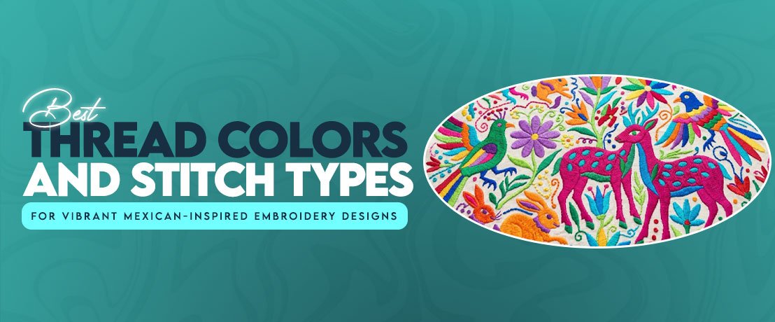
Best Thread Colors and Stitch Types for Vibrant Mexican-Inspired Embroidery Designs

Published: |Last updated:
Listen to this article
Show Quick ReadConcise summary from this article
A good color choice can change the entire character of an embroidered design. When I work with Otomi embroidery pattern ideas, I look at the artwork first and then decide how to digitize a traditional pattern without losing the strong shapes and lively color relationships that make it recognizable. The thread palette needs to work with the fabric, stitch type, and finished size rather than simply copying colors from a…
Ask AI About This Article
Answers are limited to information in this article.
A good color choice can change the entire character of an embroidered design. When I work with Otomi embroidery pattern ideas, I look at the artwork first and then decide how to digitize a traditional pattern without losing the strong shapes and lively color relationships that make it recognizable. The thread palette needs to work with the fabric, stitch type, and finished size rather than simply copying colors from a picture.
I have seen bright artwork lose its impact because the digitizer used similar shades next to each other or packed too many stitches into one small area. Mexican-inspired embroidery has plenty of visual energy already, so the goal is to control that energy. The right thread colors, stitch direction, and spacing can make the design look bright without making it look crowded.
Why Color Choice Makes or Breaks Mexican-Inspired Embroidery
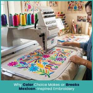
Color does more than decorate an embroidered shape. It separates animals, flowers, leaves, borders, and small details from one another.
This matters even more when several motifs touch. If two neighboring areas have almost the same thread shade, their edges can disappear after stitching.
I usually check the design in grayscale before finalizing a palette. This simple step shows whether the shapes still have enough contrast without relying on color alone.
The Cultural Roots Behind Bold, High Contrast Palettes
Mexican textile traditions include many regional approaches to color, pattern, and decoration. Otomi textiles from Hidalgo are particularly known for colorful depictions of animals, plants, flowers, and other elements from nature.
That does not mean every Mexican inspired design needs the same four or five colors. Regional textiles vary, and modern embroidery can interpret traditional ideas in many ways.
For machine embroidery, though, strong contrast remains useful because it keeps separate motifs easy to read.
When choosing colors, I look at:
- The main motif and its background
- The number of colors already present in the artwork
- Contrast between neighboring shapes
- Fabric color and texture
- Thread sheen
- Finished design size
- Whether the piece will be washed frequently
A bright palette works best when each color has a clear job.
Core Thread Color Palette for Authentic Mexican Embroidery Looks
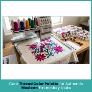
A strong starting palette can include pinks, deep blues, warm yellows, oranges, greens, and reds. You can build from there depending on the artwork.
The important part is not choosing bright thread. It is choosing shades that remain distinct after they sit beside each other.
Signature Colors: Magenta, Cobalt, Marigold, and Emerald
Magenta brings warmth and works nicely in flowers, birds, and decorative accents. Cobalt blue gives a deeper visual anchor. Marigold adds a warm yellow-orange note, while emerald green works naturally with leaves and plant forms.
These four shades can create a lively starting point, but I would not automatically use all four in every design.
For example, a floral design with several small petals may need two related pink or red shades instead of adding another unrelated color.
A useful palette might look like this:
- Magenta: flowers, birds, decorative accents
- Cobalt: outlines, larger animals, strong secondary areas
- Marigold: flowers, centers, small highlights
- Emerald: leaves, stems, and nature-based details
- Cream or white: separation and negative space when the fabric supports it
- Deep red: selective accents where extra warmth helps
The actual thread number depends on the brand because color charts vary from one manufacturer to another.
Balancing Bright Colors Without Overwhelming the Design
Using every bright shade you have can make a design harder to read. I prefer establishing one dominant color, two supporting colors, and one or two smaller accents.
This creates a visual order.
For example, if magenta dominates the flowers, cobalt can define larger animals and emerald can handle foliage. Marigold then becomes an accent instead of competing with everything else.
Also check the background fabric. A bright yellow thread may look strong on navy fabric but much weaker on a pale cream base.
Thread Type Matters: Rayon vs Polyester for Vibrant Results
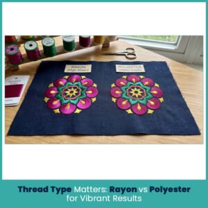
Thread material changes the way color appears after stitching. Two threads with similar color codes can look noticeably different once they cover a fabric surface.
Rayon and polyester are both common choices, but each has characteristics worth considering before selecting the final thread.
Sheen Differences That Affect How Colors Read
Rayon thread has a smooth, noticeable sheen. That shine can make saturated colors appear especially bright under direct light.
Polyester generally has a slightly different surface appearance and is known for its strength and resistance to many forms of wear.
When I compare them for colorful embroidery, I look at the finished sample rather than judging the thread from a color chart alone.
A thread card gives you a useful starting point, but fabric changes the final appearance.
The same magenta can look:
- Deeper on dark fabric
- Softer on a light cotton base
- More reflective with rayon
- More subdued depending on stitch coverage and direction
For that reason, a small stitched sample is more reliable than choosing a color from a screen.
Durability Trade Offs for Apparel vs Decor Pieces
For clothing that goes through regular washing, polyester can be a practical choice because of its durability and resistance to fading.
Rayon can create a beautiful decorative finish, making it attractive for pieces where surface appearance matters more than repeated heavy use.
For home decor, the choice depends on how the item will be handled. A wall hanging has very different demands from a cushion that gets used every day.
The thread should match the purpose of the embroidered item, not just the artwork.
Matching Stitch Types to Color Blocks for Maximum Vibrancy
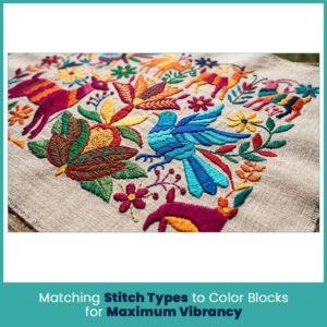
Color and stitch structure work together. The same thread shade can appear different depending on whether it sits in a satin column, fill area, or fine running line.
That is why I select the stitch type after studying the shape.
Satin Stitch for Bold Outlines and Small Accents
Satin stitch works well when a design contains narrow areas that need smooth, visible coverage. It can create clean borders around selected motifs and give small accents a polished surface.
However, satin stitch has limits.
If a column becomes too wide, the stitches may become loose or uneven. If it becomes too narrow, the digitizer may need another stitch structure.
For small Otomi style details, I pay attention to the final size before deciding whether satin will actually help.
Fill Stitch for Large Flat Color Areas
Fill stitch makes more sense for broad shapes such as animal bodies, larger flowers, leaves, and other solid sections.
The direction of the fill matters just as much as the color.
If every large area points in the same direction, the design can look flat. Changing the stitch angle between selected shapes creates subtle surface contrast even when two areas use similar thread colors.
Stitch Direction Tricks That Make Colors Pop Under Light
Thread reflects light differently depending on how the stitches sit.
I may use one direction for a leaf and another for a nearby flower. This does not require adding another thread color. The change in stitch angle can create enough surface difference to separate the shapes.
For larger areas, consider:
- Following the natural direction of the motif
- Changing angles between adjacent shapes
- Avoiding unnecessary direction changes inside tiny areas
- Keeping stitch paths smooth around curves
- Checking how the thread catches light after stitching
This technique works particularly well when you want a rich design without adding a long list of thread colors.
Avoiding Thread Shadowing on Multi Color Layers
Thread shadowing can appear when one stitched area sits too close to another or when a heavy layer shows through a neighboring section.
Stitch order matters here.
I normally plan the sequence so background areas do not create unnecessary buildup underneath smaller foreground details. Overlapping objects also need enough separation to keep their edges clear.
Sometimes the best fix is not another color. It is a cleaner stitch sequence.
Color Blending and Shading Techniques Digitizers Use
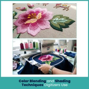
Traditional-looking designs do not always need flat blocks of one thread color. Some artwork benefits from controlled shading, especially flowers, leaves, feathers, or decorative animal details.
The trick is to blend without losing the bold character of the design.
Gradient Fill for Soft Color Transitions
A gradient fill can transition between related thread colors instead of creating a hard boundary.
For example, a flower might move from a deeper pink toward a lighter pink. The transition needs careful spacing because machine embroidery cannot create a continuous digital gradient like a computer image.
A practical approach uses separate thread shades with controlled stitch placement.
I keep gradients fairly simple in smaller designs. Too many color changes can make a small flower look busy.
Layering Thread Colors for Depth in Floral Motifs
Layering can add depth without relying on complicated shading.
For a flower, you might use:
- A darker base color
- A medium shade across the main petal area
- A lighter accent near the center
- A contrasting center detail
The final result depends heavily on stitch density and order. If every layer receives heavy coverage, the flower can become thick and stiff.
I usually reserve the strongest color for the detail that needs the most attention.
Common Thread and Stitch Mistakes That Dull Mexican-Inspired Designs
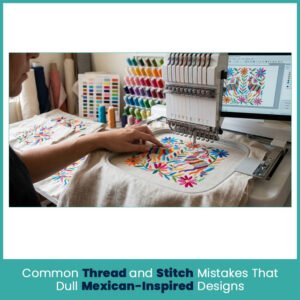
Bright thread cannot fix poor stitch planning. Some designs lose their color impact because the digitizing settings hide the very colors that looked great in the artwork.
Using Too Few Colors for Complex Motifs
A simple design may work beautifully with three or four colors. A complex composition can need more separation.
If an animal contains several important features, using one thread shade for all of them may flatten the design.
That doesn’t mean adding colors everywhere. Instead, identify the areas where color actually improves recognition.
For example:
- A darker shade can define an animal’s face
- A brighter accent can separate flower petals
- A contrasting thread can clarify small leaves
- A lighter shade can create breathing room inside a dense motif
The goal is visual separation, not a crowded color chart.
Wrong Stitch Density Making Colors Look Washed Out
Density affects how much of the fabric shows through the embroidery.
Too little coverage can make a color appear weak, especially on a contrasting fabric. Too much coverage can create a hard surface and hide the stitch character.
I check density alongside thread thickness, fabric type, design size, and stitch direction.
There is no single density value that works for every Mexican-inspired design.
Choosing Thread Brands That Hold Color Accuracy Over Time
Once you have selected a palette, staying consistent becomes important, especially when creating several matching pieces.
Thread manufacturers use their own color systems, so switching brands can change the appearance even when the shade names sound similar.
For repeat work, keep a record of:
- Thread brand
- Color number
- Thread type
- Fabric used for the sample
- Stitch settings
- Stabilizer
- Finished design size
I recommend keeping a physical thread chart near your digitizing workspace. Screen colors can vary from one monitor to another, while a stitched sample shows how the thread actually looks on fabric.
For garments, also check the manufacturer’s care instructions and test the thread before using it across a large order. A color that looks perfect under bright studio lighting may read differently after washing or under normal indoor light.
FAQs
How many thread colors should ideally be used for Mexican-inspired embroidery designs?
There is no fixed number. Around four to eight well-planned colors can work for many colorful designs, while more complex artwork may need additional shades.
Why does rayon thread look more vibrant than polyester?
Rayon has a smoother, higher sheen that reflects light strongly, which can make saturated colors appear brighter.
Is fill stitch always the best choice for bold Mexican patterns?
No. Fill stitch suits larger solid areas, while satin stitch and other stitch types can work better for narrow outlines and small details.
How can thread colors be protected from fading over time?
Choose quality thread, follow the garment or textile care instructions, avoid excessive heat and harsh washing conditions, and test the finished embroidery before regular use.
Author Bio
Matthew Davis
Senior Embroidery Digitizer
I’m Matthew Davis, a skilled embroidery digitizer with more than 15 years of practical experience. I specialize in logo digitizing, 3D puff embroidery designs, applique digitizing, custom embroidery digitizing, and working with difficult fabrics.
Over the years, I have worked with different fashion brands and production teams worldwide. I always share simple tips and useful techniques to help both beginners and businesses improve their embroidery work.
Promote your articles nowCheck for details
Choose a promotion package
Choose a package below, scan the QR code and pay the displayed amount for 20 days.
After payment, email your article title and payment screenshot to info@yourneeds.asia. Once confirmation is received, one of our administrators will activate the promotion.

Choose where your promoted article receives extra visibility
Promotion changes presentation and placement for the selected period. It does not guarantee traffic, enquiries, search ranking or sales.
Priority visibility in the VIP Lounge, promoted shelves and highlighted article areas.
Top-style highlighting in article directories, homepage feeds and promoted article blocks.
Premium styling across supported article feeds, recommendations and directory placements.
Featured presentation in supported homepage, category, directory and related-article areas.
Build a stronger online presence for your business
Get Your Website for ₹15,000
Are you listed and don't have a website for your business? We can plan, design and launch a responsive website that makes your business easier to understand and contact.
Get My WebsiteSEO Starts from ₹10,000/Month
Improve how your business is presented across Google, local listings and AI-powered search results with ongoing SEO, content and authority-building work.
Improve My VisibilitySuggested Articles
View all articles
Indoor LED Video Wall for Corporate Spaces: Elevate Your Office with Yeon LED
https://yeonled.com/ The modern corporate environment communicates through its physical space. Clients, investors, and employees all form impressions the moment they walk through the door.…

Matka420 – Latest Results and Chart records
Introduction to Matka420 Matka420 is an online-focused information topic associated with Matka results, charts, historical records, and commonly used result terminology. Visitors searching for…

Five Reasons Why AllPanel777 Are Good for Online Betting
Allpanel777 sports book site gives you a great and simple platform to explore all available betting options without complicated navigation and confusing menus. 1.…

HIS Hospital Information System in India: Features, Benefits & Guide
Patient records, lab results, prescriptions, billing hospitals churn through a huge amount of information every single day, and without something holding it all together,…
Latest Blog Posts
View all articles
10 Best Neurosurgeons in Varanasi for Brain, Spine and Neurological Care
The brain and spine are among the most complex parts of the human body, and problems affecting them can influence movement, sensation, balance, speech,…

What are the advantages of choosing a management recruiters agency for employees?
Here are the advantages of choosing a management recruiters agency: - 1. Better Job Opportunities Access to relevant job opportunities is one of the…

How to Choose Residential Apartments in Siolim for Everyday Living
Choosing a home in Goa is not only about finding a beautiful building. Your daily routine matters just as much. You need to think…

Computer Vision Solutions for Robotics: AI Vision Systems | Kivo.ai
Computer vision solutions for robotics help machines see, understand, and respond to their surroundings using AI powered visual intelligence. These systems can support robots…

Matka420apk – Matka 420 Results
Introduction to Satta Matka Satta Matka is a traditional Indian number-based game format with a long history and a wide range of market names,…

What type of casino games are available on the radheexchange platform?
Depending on the region, Radheexchange provides a wide variety of different casino formats such as live dealer tables, Indian card games, roulette, blackjack and…