

Designing a Logo or Monogram for Your Next Jacket Project
Many people pick a design that looks sharp on screens and then feel surprised when the final jacket doesn’t match. Screen designs and stitched designs follow different rules. If you want your best logo design software results to look great on fabric, plan for stitches from the start. That is especially true with embroidery digitizing for jackets, where thick material and curved surfaces change everything.
Basically, a clean jacket logo or monogram starts with the right choices long before the needle moves. You pick the style that fits the placement, keep the lines thick enough, and match the design to the fabric. Do those things and the final result looks sharp and professional instead of stiff or messy.
Why Most Jacket Logos Look Great on Screen but Fail on Fabric
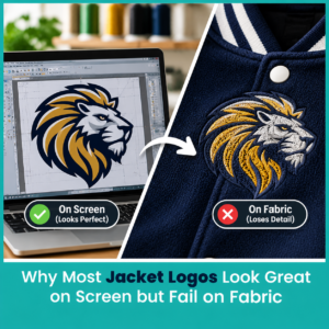

Digital files show every thin line and tiny detail with perfect clarity. Embroidery machines can’t do that. Thread has thickness. Fabric shifts under the needle. Dense areas pull the material inward. Thin lines disappear or break. Gradients turn into muddy patches. A design that looks perfect in pixels often turns into a stiff, puffy, or broken result once it hits a jacket.
The bigger problem shows up on heavy fabrics. Leather, thick denim, and nylon don’t behave like a thin t-shirt. They fight the stitches more. Without the right adjustments, the logo sits on top of the fabric instead of becoming part of it. You end up with puckering, gaps, or a design that looks cheap even if the original artwork was strong.
The Gap Between a Digital Design and a Stitched Result
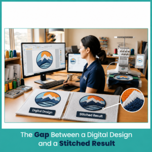

A digital logo is a picture. A stitched logo is a series of thread commands that build the design one stitch at a time. The digitizer has to decide stitch type, direction, density, and underlay for every shape. Those decisions depend on the final size and the fabric. Scale a small chest logo up for the back without rebuilding the file and the satins get too wide, the fills get too heavy, and the whole thing distorts.
Fabric stretch and thickness also create a gap. What sits flat on a screen will pull and shift on a jacket. That’s why the same artwork needs different treatment for a left chest placement versus a full back. Ignore that gap and the final jacket never looks as good as the mockup.
Common Mistakes That Ruin Jacket Logos
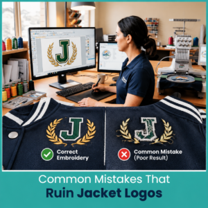

Here are the mistakes that show up most often:
- Using thin lines or fine details that the machine can’t hold
- Choosing too many colors when fewer would look cleaner and cost less
- Scaling a small design up without rebuilding the stitch file
- Ignoring the fabric type and using the same settings for denim and leather
- Making text too small so the letters close up or become hard to read
- Skipping proper stabilizer so the design puckers or shifts
These mistakes turn a good idea into a disappointing result. Most of them are easy to avoid once you know what the machine needs.
How to Choose Between a Logo and a Monogram for Your Jacket
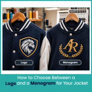

Both options work well on jackets. The better choice depends on the message, the space, and the look you want.
When a Full Logo Makes More Sense
A full logo works best when the brand name or icon needs clear recognition. Larger back placements give the logo room to breathe. Team jackets, company outerwear, and event pieces often look stronger with the complete logo. If the design has strong shapes and limited detail, a full logo holds up well at bigger sizes.
When a Monogram is the Smarter Pick
A monogram shines on smaller placements like the left chest or sleeve. Initials stay clean and readable even when space is tight. Monograms also feel more personal or classic, which suits varsity jackets, private labels, and individual gifts. They usually need fewer stitches and fewer colors, so they sew faster and sit lighter on the fabric. For many jacket projects, a monogram design software approach gives a cleaner, more refined result than forcing a complex logo into a small area.
Design Rules for a Logo or Monogram That Stitches Cleanly
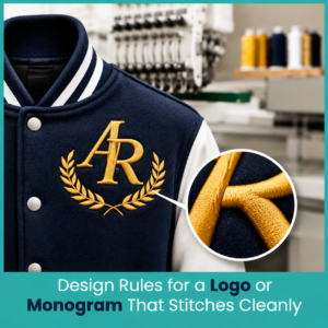

Good embroidery design follows a few simple rules that keep the stitches looking sharp.
Keep Details Simple and Line Weights Thick Enough
Thin lines break or disappear under the needle. Keep line weight thick enough for satin stitches to form properly. Remove tiny gaps and extra flourishes. Simple shapes hold up better on jackets. Bold outlines and solid fills almost always look stronger than delicate detail work.
Pick Colors and Thread Counts That Suit the Jacket Fabric
Fewer colors usually look better and sew cleaner. Three to five thread colors work for most jacket logos. Dark jackets hide lighter thread a bit, while light jackets show every shade. Match the thread to the fabric weight so the design does not sit too high or sink too deep. Avoid heavy fills on thin nylon and light density on thick leather.
Choose the Right Size for Chest, Sleeve, or Back Placement
Left chest logos sit between 2.5 and 3.5 inches wide. Sleeve placements stay smaller, often 2 to 3 inches. Full back designs can run 10 to 12 inches wide or a bit more on larger jackets. Measure the actual garment before you lock in the size. A design that fits one jacket may look cramped or oversized on another.
Fabric and Placement Decisions That Change the Final Look
The fabric decides how the stitches behave. Placement decides how much space and curve the design has to handle.
Leather, Denim, Varsity Wool, and Nylon: What Works on Each
Leather needs light density and careful hooping or floating so it doesn’t leave marks. Denim handles denser stitches well but still needs solid underlay. Varsity wool can be thick and slightly stretchy, so it benefits from stronger backing. Nylon is slick and less forgiving. It works best with lower density and good stabilizer so the stitches do not shift.
Stabilizer and Backing Choices for Heavy Jacket Fabrics
Heavy jackets almost always need cut-away stabilizer for lasting support. Tear-away works on stable woven areas with lighter designs. Leather often needs adhesive stabilizer so you can float the material instead of hooping it hard. Textured fabrics sometimes need a water-soluble topping on top so the stitches sit cleanly on the surface instead of sinking in. Matching the backing to the fabric prevents most puckering and shifting problems.
Preparing Your Artwork for Digitizing
Clean artwork makes the digitizing step much smoother. Start with vector files whenever possible. AI, EPS, or SVG files keep the edges sharp at any size. If you only have a raster file, use a high-resolution PNG at 300 DPI measured at the final embroidery size. A transparent background helps. List the exact size, placement, and fabric type when you send the file. That information lets the digitizer build the right underlay, density, and stitch order from the start.
After working with hundreds of jacket designs over the years, I learned that the cleanest results come from simple shapes, correct size for the placement, and a file built specifically for the fabric rather than a generic conversion. Those three things separate designs that look professional from ones that look like an afterthought.
File Formats and Resolution Your Digitizer Actually Needs
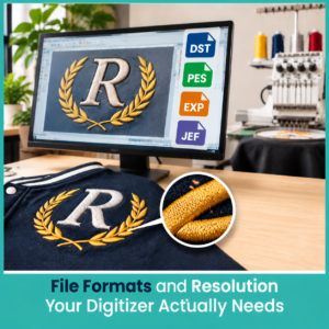

Vector files remain the top choice because they scale cleanly. High-resolution PNG files work as a solid backup when vector is not available. JPG files are the least helpful because compression softens the edges. Always include the final size in inches and the exact placement. The digitizer needs that information to set the correct stitch parameters. A good file at the right size saves time and produces a cleaner sew-out.
FAQs
What is the best size for a logo on a jacket chest?
Most left chest logos work best between 2.5 and 3.5 inches wide so they stay clear of the arm and look balanced.
Can I embroider a monogram on a leather jacket?
Yes. Use light density, adhesive stabilizer, and float the leather instead of forcing it into a tight hoop.
Which file format works best for jacket embroidery digitizing?
Vector files such as AI, EPS, or SVG give the cleanest results. High-resolution PNG is the next best option.
How many thread colors should a jacket logo have?
Three to five colors keep the design clean and the stitch count reasonable for most jacket projects.
Author Bio
Matthew Davis
Senior Embroidery Digitizer
I’m Matthew Davis, a skilled embroidery digitizer with more than 15 years of practical experience. I specialize in logo digitizing, 3D puff embroidery designs, applique digitizing, custom embroidery digitizing, and working with difficult fabrics. Over the years, I have worked with different fashion brands and production teams worldwide. I always share simple tips and useful techniques to help both beginners and businesses improve their embroidery work.